Adapt UI Kit

Adapt UI Kit
for Adobe® XD®

Share functioning prototypes of Adapt courses with clients in minutes rather than days.

Buy it now
All core Adapt components
13 components, 5 extensions, 1 menu, 6 layout containers, 200+ elements. Created in 3 sizes: mobile phone, single-width, full-width. More components to come.
Well-layered and organized
Atomic construction means components layers mirror Adapt code. Page layouts are built with articles, blocks, and components.
Templates for mobile & desktop
Course prototypes are supplied in two sizes: mobile phone and desktop. Customize these directly by drag-n-dropping both components and images.
Vanilla theme resources
References for colors, typography, and 238 icons. Use these to build your palette and font hierarchy. Update them to start your own style guide.

The Adapt UI Kit is a collection of Adobe® XD® components, styles, and resources based on the Adapt e-learning framework.

  • Drag and drop Adapt components to build high quality prototypes of Adapt courses
  • Apply styles that cascade throughout components
  • Create storyboards
  • Share code with your developers
  • Prototype custom components

The collection is too long to list, so check out the preview file instead!

1
Copy templates
Begin by duplicating a template. Then duplicate enough blocks to accommodate your components. Duplication preserves the padding that imitates the Adapt's Vanilla theme.
2
Drag components
XD components — modeled with precision on Adapt's standard components — are ready for you to drag into place. It couldn't be simpler!
3
Customize styles
Introduce branding by customizing color and typography styles. Your styles cascade through-out the components. Have fun with borders and spacing, too.
4
Add content
Delete placeholder you don't need. Copy and paste text into position. Drag images into place as graphics and backgrounds.

Functional and interactive

The UI Kit components have been constructed using XD’s latest features: stacks, padding, and states. They have been wired as functional prototypes where possible and appropriate. Buttons change color on hover and switch pages when they’re clicked.

Wireframes and static mock-ups fill a need. But there are times that call for a little extra. Now you can have that little extra every time. Prototypes are no longer a luxury with the Adapt UI Kit. Let them find a regular place in your solution development, brainstorming, and art direction.

Branded in minutes

The Adapt UI Kit uses the same cascade as the Adapt framework. Simply change a color or font in the Assets Panel and watch it propagate throughout your design. Basic branding is that easy. Take it up a notch with backgrounds: assign colors in the property inspector and drop in place your images. See how rapidly the visual brand takes shape. We’ve spent time faithfully recreating Adapt components so that you can spend time on the creative process. Create something that will impress!

Customized with Confidence

When you create a design with the Adapt UI Kit you begin with accuracy. We worked diligently to reproduce faithfully the dimensions and spacing of Adapt components. Starting your design with an accurate model supplies a type of guard rail. Modify whatever you want. But whatever is not changed remains true to Adapt styles. This produces a result that is easier to implement, and one that is less open to interpretation.

When your design is ready for production, your developer will appreciate the coordination between XD components and Adapt code. Naming conventions are familiar. Nested elements are predictable.

"What really separates Adapt from other authoring tools like Storyline is the full page, vertical scrolling experience. Creating Adapt courses is more akin to professional web design. The Adapt UI Kit makes it able to create these experiences in minutes."

- Simon Date, Adapt Tips co-founder

Delight clients

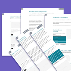
If your business involves working with clients, you'll know how important their brand identity is to them. Using the UI kit you can create a prototype to show them an example of what their branded content will look like in Adapt.

This extra prototyping step is used by some of the top e-learning agencies as a way to bring extra confidence and prove themselves as a premium supplier.

Keep the team aligned

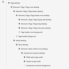
When working with a team of designers and developers it's critical to ensure they are on the same page. Many designers may only have limited experience with Adapt and may not be aware of how each interaction works.

By allowing them to build interactive prototypes themselves with all the components and extensions avilable to them they can become more acustom to Adapt.

Save designer's time

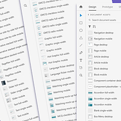
We've spent hundreds of hours making this UI kit the perfect tool for any team using Adapt. Designers can use the template and start creating prototypes from the start.

"We'd been discussing the hurdles teams encounter when working with Adapt. We wanted to create something that would lower them, someting that would improve the workflow. And for over a year the UI Kit was at the center of that conversation. Now — finally — teams have a tool that can save them dozens of hours per project."

- Chuck Lorenz, Adapt Tips co-founder

Adapt UI Kit

Loading...
BUY NOW

You'll receive instructions on how to download the UI Kit upon purchase.

By purchasing you are agreeing to the licence.

What's included?

✓UI Kit for XDWe'll email you a link to download the Adapt UI Kit upon purchase.
✓Ongoing updatesIn addition to the standard bug fix guarantee you'd expect, you'll get free access to new Adapt components as they are added to the UI Kit.
✓Video guidesFull access to a series of short videos that explain how to use the UI Kit. Accessed through the ADAPT.tips website.
✓Personal SupportWe want your team to have the highest level of success with our product and will support them via phone or email with any questions or queries they have.

Frequently Asked Questions

^

We encourage you to buy via credit card, using this link.

If you would prefer to pay via invoice with bank transfer we can also accommodate that, however, we reserve the right to charge up to an administration fee of up to 10% for any purchase made this way. Please email uikit@adapt.tips to arrange this.

^

If you would like to see a non-functional version of the UI Kit, you can download the preview file for free.

If you would like us to give you a demonstration of the real version, please email us at uikit@adapt.tips.

^

The Adapt UI Kit is designed for e-learning teams who can benefit from creating prototypes of Adapt courses and themes. We envision that this product can benefit both agencies who work with clients and in-house departments creating their own theme(s).

The UI kit itself is an Adobe XD product, designed to be used by Graphic artists and Art Directors who will be responsible for designing the theme. Once they have finished creating the prototype they can publish it for a Developer to begin building it in the Authoring Tool or Framework.

^

We have created a series of video guides and articles to help support people using the UI Kit.

If you require further assist you can email us at uikit@adapt.tips and we will help you. Please note, we will only provide support for our product, not general Adobe XD proficiency. If you would want help with that we would recommend finding resources on Youtube or Google.

^

Our no-hassle, 14-day happiness policy means that, for any reason, we’ll work with you to make sure you’re happy, even if that means a full-refund.

^

The Adapt UI Kit includes all of the core plugins: Box Menu, all core components, all visible core extensions, and layout structures (page, article, block, navigation bar, and slide-out drawer). Two configurations are provided for Narrative. You also get Page Nav, Search, Flipcard, and 238 icons. All XD components are provided in multiple sizes where applicable: mobile, single-width, and full-width.

^

The UI Kit includes three third-party plugins: Page Nav, Search, and Flipcard. We will add more with future releases at no additional charge. If you have any suggestions, don't hesistate to forward them to us.

^

Yes, when you buy the UI Kit you are buying a multi-user licence which can be used by anyone in your team.

With XD you can publish the UI Kit as a library on your company network. You can also customise it per project and share each project library. Your licence does not permit sharing Adapt UI Kit components publicly whether for free or for profit.

^

Both!

The Adapt UI Kit is all about communicating design ideas. Whether you are designing a theme or brainstorming a new Adapt component, the Adapt UI Kit helps you and your stakeholders visualize the solution. It doesn’t matter if you intend to implement your design with the Adapt Framework or Adapt Authoring Tool.

^

The UI Kit is designed primarily for teams using Adapt Learning (Open-source Adapt) and, out of the box, provides a replica of the Vanilla theme (the default theme of Adapt Learning).

With that being said, Learning Pool Adapt does provide all of the components and extensions used in the Adapt UI Kit and also does the Vanilla theme, albeit without access to the colour picker. So it is possible for a team using Learning Pool Adapt to use this product, either:

  • by modifying the UI Kit to replicate a Learning Pool theme, or
  • by using the Vanilla theme and applying any changes within the Style Editor (Custom CSS) section.

We are looking to maintain and improve this tool for the long term for our customers, so if you would like us to build support for themes that come with Learning Pool Adapt, or even Evolve, please email us to let us know.

^

Not directly, but Adobe XD does allow you to publish your prototype in developer mode, which will provide developers with hexcodes and precise CSS variables that they can copy and paste into the project.